What if the A1 Business app actually felt easy?
.png)
A1 Business App Redesign
Year: 2024
Scope: Product, UX, and UI redesign
Work done:
Research and problem framing,
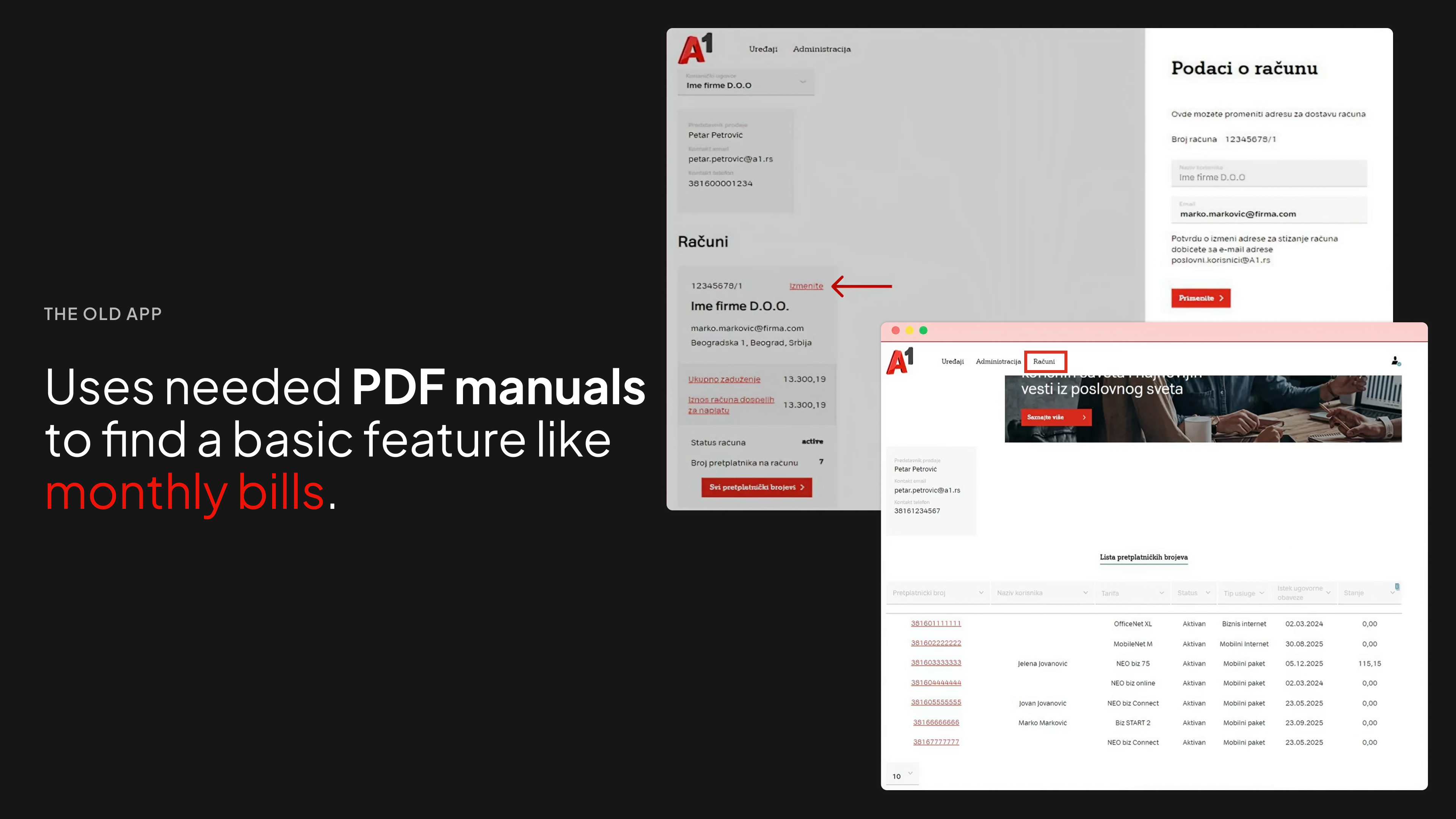
Analysis of existing app issues,
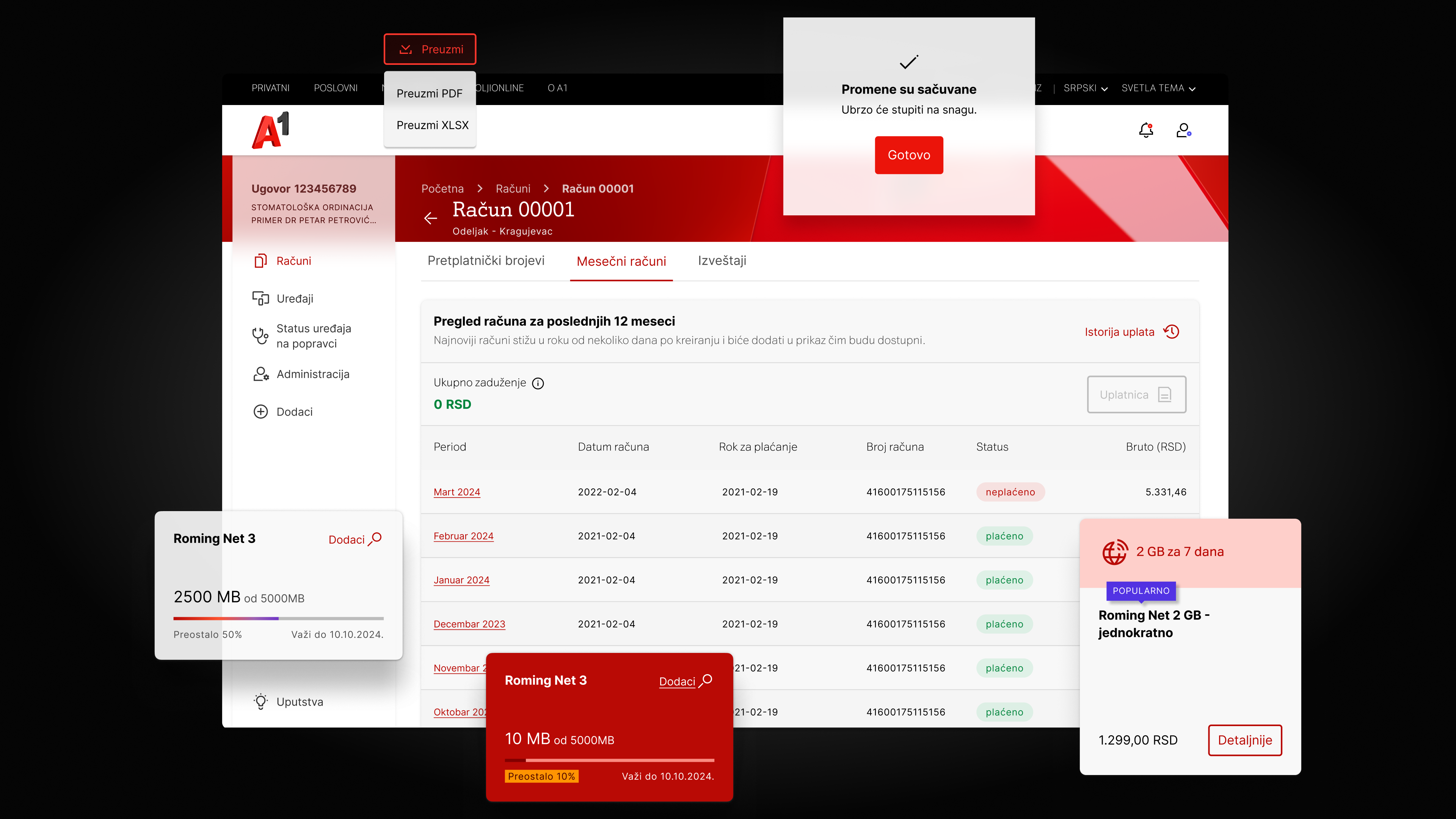
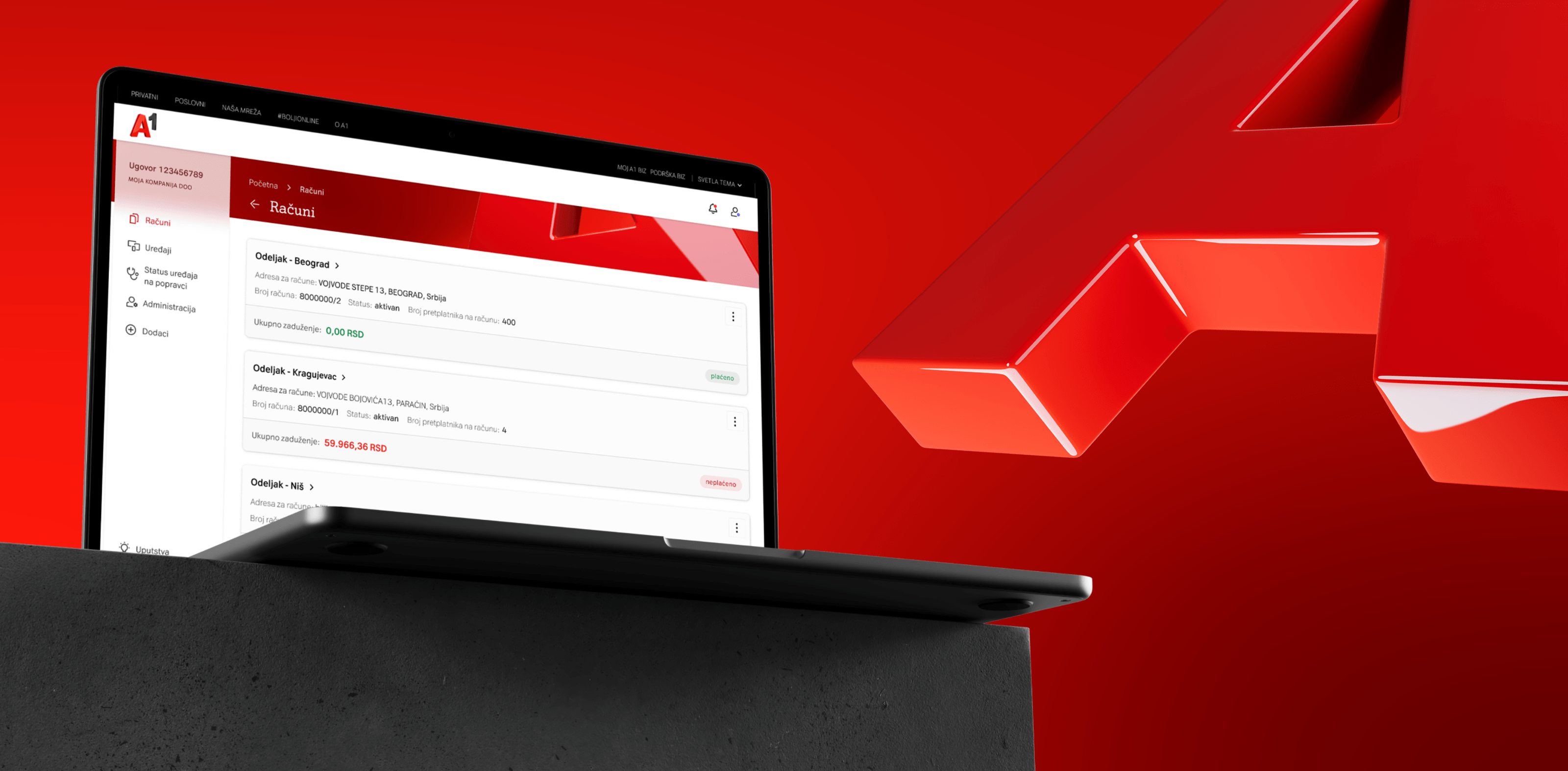
Information architecture improvements,
Navigation and flow simplification,
Visual refresh aligned with A1 brand
.png)
.png)
Less effort. More confidence.
By stripping away noise and reordering what matters, the app starts working the way users expect it to. Key actions show up instantly. Navigation stops asking questions. The UI gets out of the way. The result is not a louder design. It is a calmer one. An app that feels obvious, trustworthy, and surprisingly quick to use.
.png)
My contributions
Over the past year, I worked as a UI UX Designer and Product Owner on three core A1 platforms.
Moj A1, Moj A1 Biz, and A1 Web.
My focus was simple.
Make products easier to use, better rated, and easier to find.
The result:
Higher App Store and Google Play ratings, stronger SEO, and consistently positive user feedback.
I worked closely with developers, marketing, and business teams to turn real user needs into shipped solutions.
Always aligned with business goals.
Most users were on mobile, so I designed responsive, accessible, and SEO friendly interfaces for a1.rs and a1.rs business.
Better usability, better engagement.
I introduced agile design delivery with biweekly iterations, clear roadmaps, and led the redesign of two major platforms.
That directly improved performance, experience, and customer satisfaction.
Here are some of the projects I've contributed to: